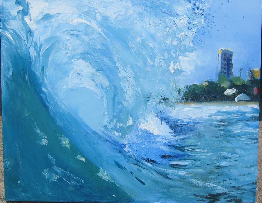
 this is a comission for a local surf shop. just getting color in....updates on it later.
Subscribe to:
Post Comments (Atom)
Fellow Artists and Friends
- Adam Volker
- Alberto Mielgo
- Alex Kanevsky
- Anastasia Garcia
- Andrea Wickland
- Andrew R. Wright
- Art and Influence
- barron storey
- Charlie Griak
- Chris White
- Daily Raisondetre
- Daniel Egneus
- Danny Robbins
- David Hughes
- Derek Gores
- Doug Chayka
- Dustin Darnault
- Edward Kinsella III
- Erik Jones
- Francis Vallejo
- Gary Kelley
- George Pratt
- Illustration Art
- jack unruh
- James Gurney
- Jane Radstrom
- Jenny Saville
- Jeremy Lipking blog
- Joe Ciardiello
- John H. Bryan Attorney at Law
- Justin Runfola
- Kansas City Drawing
- Kent Williams
- Kyler Dannels
- Les Herman
- Lindgren and Smith
- Lynn Pauley
- Michael Hussar
- Michael P. Sincavage
- Nathan Fowkes
- Nathan Fox
- Oscar Grillo
- protanimation
- Ralph Steadman
- Retro Vintage Romance- photoblog
- Robert Baxter
- Sarasota Polo Club
- Shawn Yu
- St. Louis Polo Club
- Sterling Hundley
- Sterling Hundley's Show Process
- TAD KCMO Blog
- The Illustration Academy
- Todays Inspiration
- Vintage Posters
- William Wray
Blog Archive
-
▼
2006
(43)
-
▼
July
(9)
- a series in progress of my to cats.
- No title
- in progress....
- micron pen,sketch of Kiera at the painters guild.
- micron pen...3x5
- I finally got this on finish.
- this is a comission for a local surf shop. just ge...
- painting of my new roomate julia. She likes to be ...
- this is on a good size canvas...just concentrating...
-
▼
July
(9)
2 comments:
i like this one the most. the perspective and the shot is beautiful. the colors as well. sweet job man!.. it looks like there are a few leaves in the foreground, i def. think a few yellow and orange leaves in the front would look pretty sweet, i dont know why.
sweet job. cheers
-Neil
I must say I really like the upper left corner, it has good texture and abstract quality. So if you can make the rest of the piece up to that level, it will be good. Being an abstract closeup that doesn't have a lot of values, good color and texture is key.
Post a Comment